Graphing Comparisons
I plot the same data using a few different programs to see how they compare. I've tried to keep the plotting size about equal each time.
Example 1
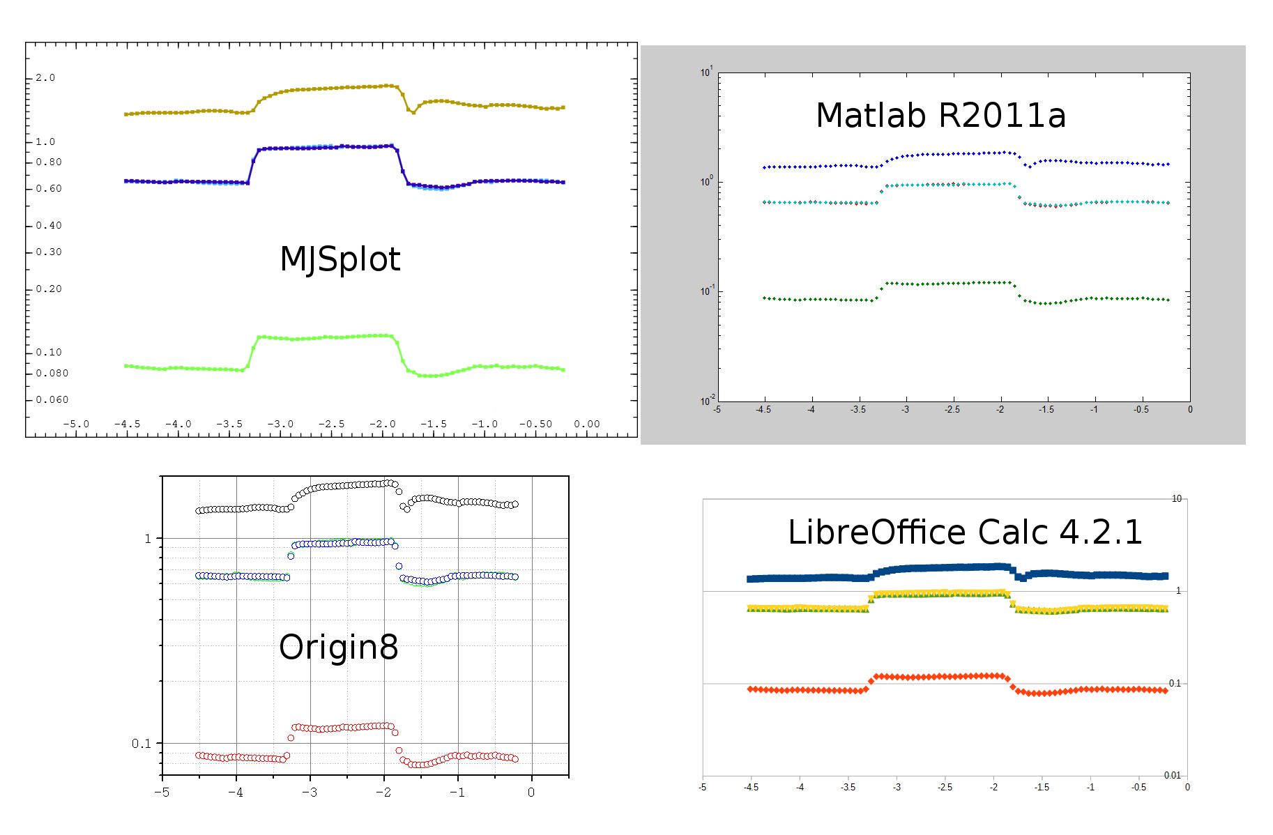
Here I use some programs I have to hand. All the graphs use the auto scales or equivalent.
padding:
- MJSplot: No external padding around MJSplots's graph.
- Origin8:Large external padding around Origin8's graph means the plotted area is quite small.
- Matlab: Matlab uses less padding and has a reasonable plot size.
- Calc: makes good use of space.
Scale choice:
- MJSplot:Start below the data and finish above the data. Data has good spacing around the edges. Starts and ends on nice numbers
- Origin8: Starts and ends on obscure numbers. Causes data to be pushed right to the top.
- Matlab, Calc: Picks the nearest order of magnitude. Lots of wasted space.
Labeling:
- MJSplot: Labels go up in sensible amounts.
- Origin8: Gives only the orders of magnitude. Good use of minor ticks but not above 1 (in this example).
- Matlab, Calc: Only 10^xs
Example 2
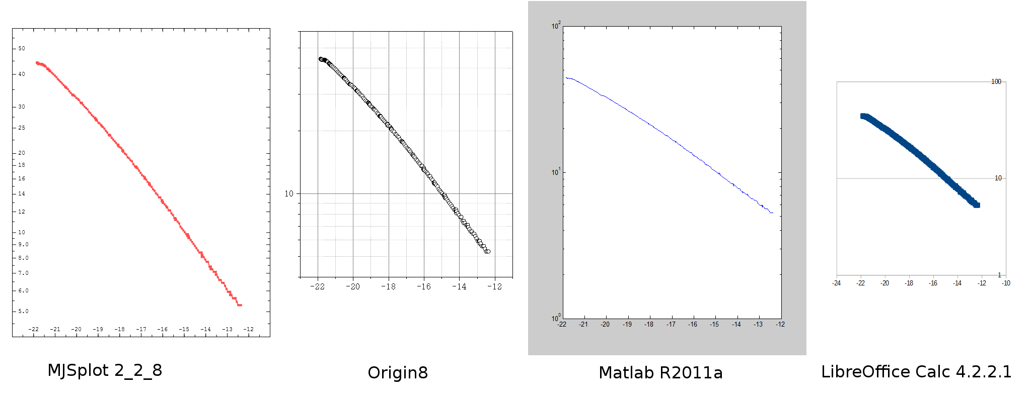
Note how MJSplot automatically picks a scale the increases in 1s, then 2s, then 5s, then 10s as the y axis increases. Others just don't even try.
Example 3
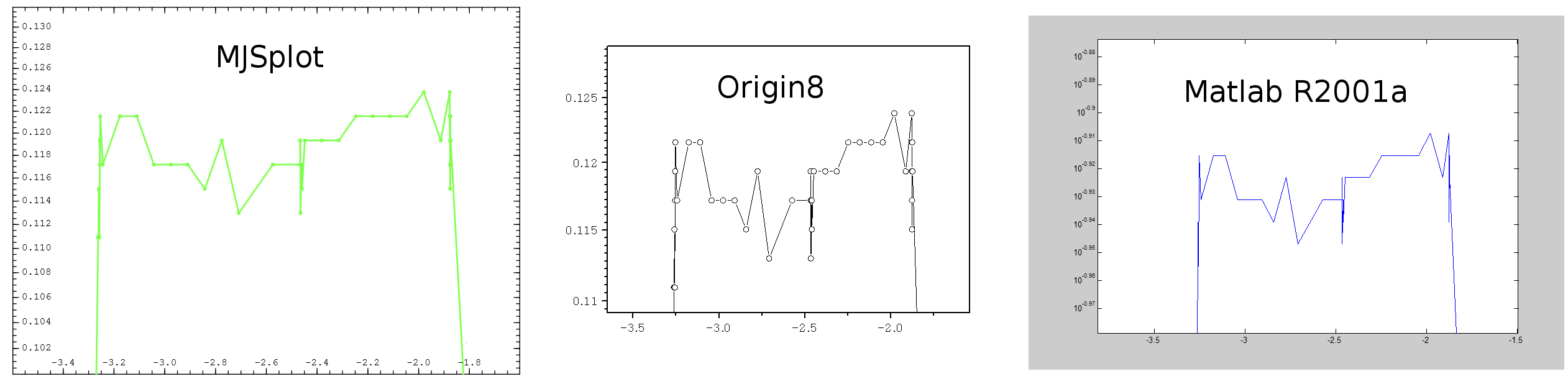
This is a logarithmic graph zoomed into a region spanning much less than a decade.
I don't find Matlabs use of scale very helpful: 10-0.94,10-0.93,10-0.92, etc.
Origin forgets about keeping constant significant figures on the numbers, 0.11 and 0.12 should be 0.110 and 0.120 to match with the rest of the scale. The scale starts and ends on obscure points again leaving a large gap above 0.125 that looks odd.
MJSplot doesn't have any of these issues
.